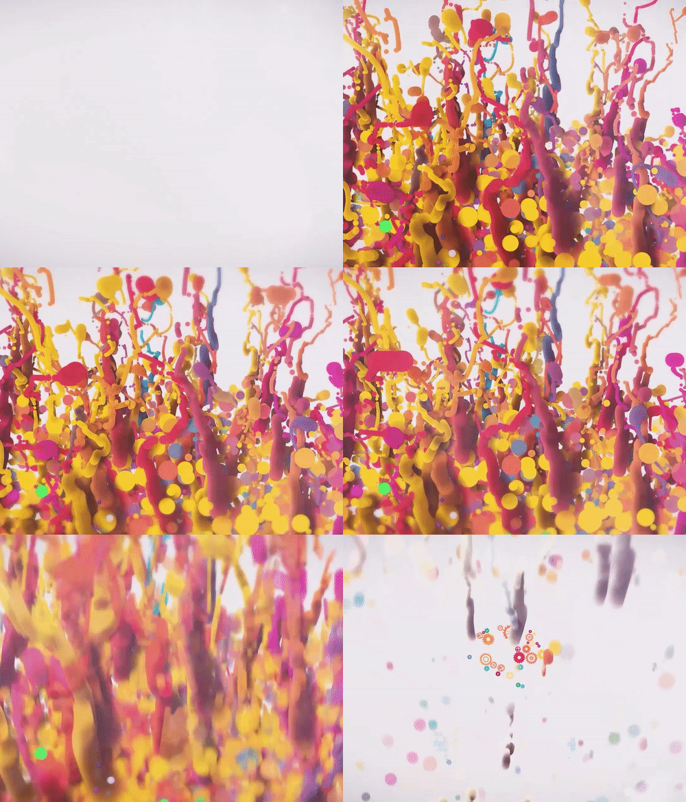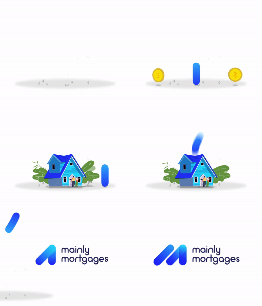
While I learn the basics of graphic design and 2D animation, I'll attempt to design and animate random logos on the internet, business logos for my friends, and logos I manage to design 🥵
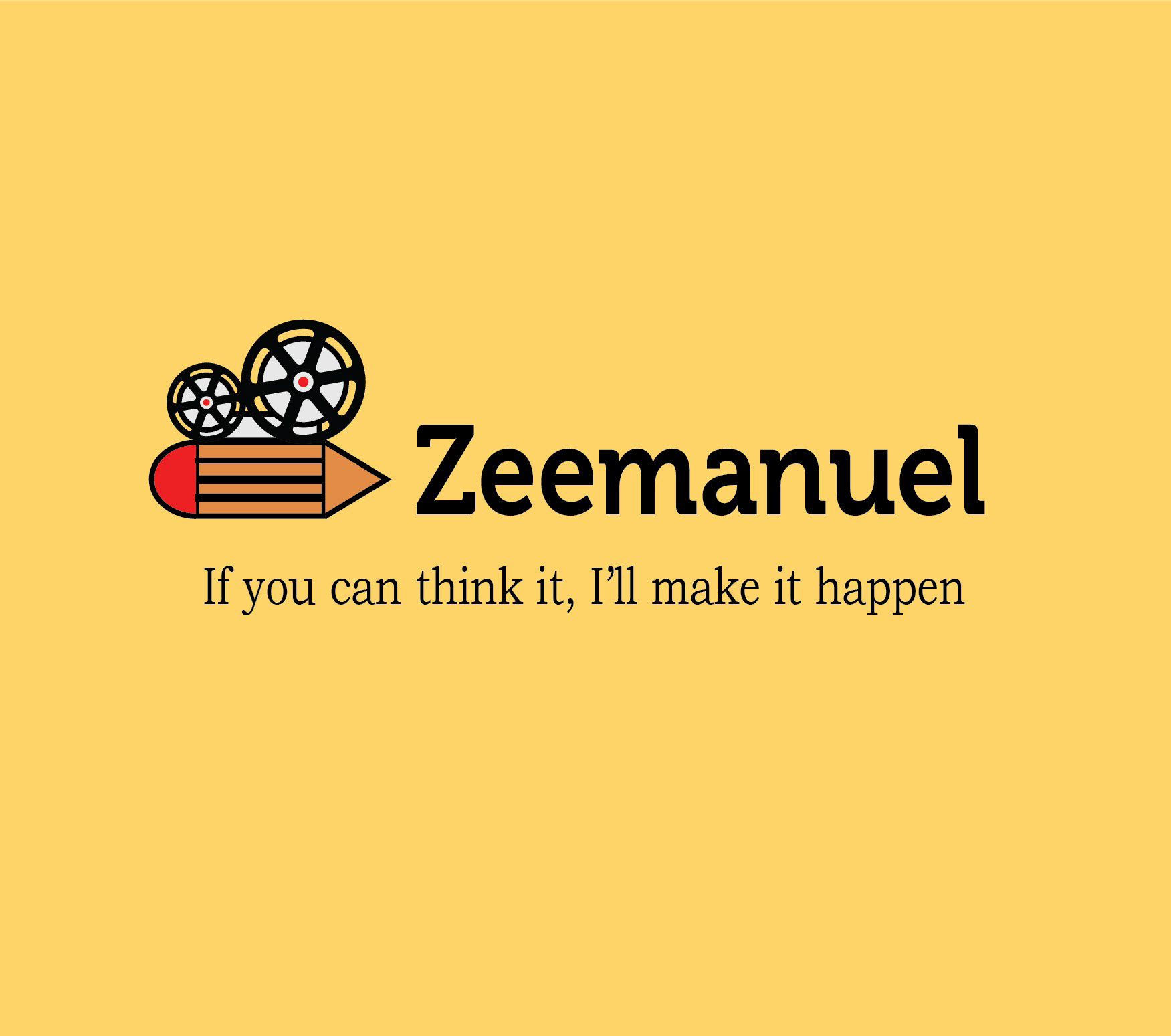
Today, I decided to redesign my logo by changing to a more energetic and enthusiastic color, reducing the icon size while completely eliminating the tripod stand in the previous design, and changing the font.
Honestly, I still struggle with choosing colors for design projects, but I think this 'Light Mustard' color is pleasing to the eye. 😉😉😉
Well, this is it. 👌
Today, I decided to redesign my logo by changing to a more energetic and enthusiastic color, reducing the icon size while completely eliminating the tripod stand in the previous design, and changing the font.
Honestly, I still struggle with choosing colors for design projects, but I think this 'Light Mustard' color is pleasing to the eye. 😉😉😉
Well, this is it. 👌